Project 6 – Type and Image: Part 3
I have finished the final InDesign version of the article (PDF). I learned a lot of useful things in InDesign, and I think the article turned out fairly well. The structure and style is clear, consistent, and readable across the article, and the images add to the meaning without being too distracting. The reader should be able to follow the flow of the text easily, as well.
You can also see previous versions below:
Project 6 – Type and Image: Part 2
I have finished a preliminary version of the article (PDF).
The modular layout is working well, but I am having difficulty laying out the text without having content break across pages. Also, the text is too large and the spacing is inconsistent. I should be able to fix these and finish the coloring and adding images without too much trouble. I will focus on fitting the text in the allotted space first, and then do pull-quotes, images, and captions. I will fix the header last.
Project 6 – Type and Image: Part 1
I chose the article Java Man by Malcolm Gladwell. The article has interesting subject matter that will yield interesting visual aids. For example, I plan to include an image contrasting the original Coca Cola recipe with the current one, as well as portraits of some of the historical figures mentioned in the article for their drug habits.
The article is about coffee, so I am leaning towards a brown and tan theme, perhaps with some blue and orange for emphasis. The target document size is 1024×768, which is 4:3. This lends itself to a modular grid, so I will probably be arranging sections of the article on a 16×12 grid of 64-pixel squares.
Project 5 – Information Visualization: Sketches
1. Gantt chart
2. Gantt chart in radial section of clock
3. health
4. stress
Project 4 – Typographic Variables: Part 4
4a. Color & everything before: Make 4 final variations. Print out all 4. Mount on to black board.
Start with a complete solution to one of the previous nine exercises; explore how color can emphasize or complement the typography. Consider color in shapes behind the type; color in the type; color in limited amounts; color all over the piece; try analogous color palette with one contrasting hue, complimentary colors, try a strong palette, an ugly palette, a cool palette, a loud palette etc. After a few explorations with one idea, move to another idea and explore some more. The goal is wide and brave exploration, keeping in mind, of course, that communication is still your goal!
Final Format
All exercises should be printed out 8.5 x 11” paper. Parts 1-3 should be printed in black and white. Exercise 4 should be printed in color. From Exercise 4, choose one to mount on black board. The border should be 1” around all sides. (This makes the blackboard 10.5″ x 13″) I encourage you to enlarge the final poster to be larger than 8.5 x 11” but it is not required. If Part 4 has color that bleeds off the page, print it on 11 x 17” paper with crop marks and cut it out. Don’t forget to write your name on the back and label which exercise they are from. Please do not staple. Use paper clips or folders to keep your work together. Turn these in at the end of the critique on Thursday October 7.
Design Considerations: Of every variation, ask yourself these questions.
- What is most important information? next in importance? and next?
- How do you visually signal this? with space? with position? with weight?
- Where are you positioning the text on the page?
- How is the viewer’s eye traveling around the page?
- Refer to your design principle and elements for ideas for new composition ideas.
Project 4 – Typographic Variables: Part 3
3a. Size change & typographic weight: Make 5 variations
- Select any two weights (Helvetica Neue light, roman, medium, bold).
- Use a change of point size to emphasize hierarchical differences.
- You may change the order of the information, if you wish.
- Horizontal (also called margin) shifts and linespacing are optional.
- This is your call.
- Think carefully.
3b. Graphic elements: rules, bullets, geometric shape: Make 5 variations
- Start with a complete solution to one of the previous eight steps.
- Add any of these graphic elements: rules (your choice of weight), bullets (dots, your choice of size and weight), and geometric shapes.
- Stay with black, white and values of grey (% of black) in your graphic elements, bullets, rules and type.
- Again, this is your call.
- Try a range of starting points, not just one.
- Be adventurous and try many ideas.
- Explore!
Project 4 – Typographic Variables: Part 2
2a. Linespacing & typographic weight: Make 3 variations
- Select any two weights of Helvetica Neue.
- Think about logical groups of information.
- Insert blank spaces between lines of type.
- Use only full line spaces. Do not insert two blank lines together or half a line.
- Using weight changes and space between lines, lead the viewers eye through groups of information.
2b. Typographic weights & horizontal shift: Make 3 variations
- Select any two weights of Helvetica Neue.
- Think about logical groups of information.
- Shift lines of type horizontally left or right.
- You should have two flush-left margins.
- Do not add extra space between lines of text.
- Using weight changes and a shifting left margin to lead the viewers eye through groups of information.
2c. Horizontal shift & linespacing: Make 3 variations
- Use just one weight of Helvetica Neue. Set all the type in that weight.
- Figure a few different ways to group information.
- Insert blank spaces between lines of type.
- Use only full line spaces. Do not insert two blank lines together or half a line.
- Shift lines of type horizontally left or right.
- You should have two flush-left margins.
- Using linespacing and a shifting left margin to lead the viewers eye through groups of information.
Project 4 – Typographic Variables: Part 1
1a. Linespacing: Make 3 versions
- Use just one weight of Helvetica Neue. Set all the type in that weight.
- Figure a few different ways to group information.
- Insert blank spaces between lines of type.
- Use only full line spaces. Do not insert two blank lines together or half a line.
1b. Typographic weights: make 3 versions
- Versions 1 and 2, use two weights
- Select any two weights of Helvetica.
- Figure a few different ways to group information.
- Set all the type in a combination of those two weights.
- Do not add extra space between lines of text.
- Version 3, use four weights
- Select four stroke weights to use in combination.
- Do not add extra space between lines of text.
1c. Horizontal shift: two flush-left margins: make 3 versions
- Use just one weight of Helvetica Neue. Set all the type in that weight.
- Shift lines of type horizontally left or right, resulting in only two flush-left margins.
- Do not add extra space between lines of text.
1d. Horizontal shift: three flush-left margins: make 3 versions
- Use just one weight of Helvetica Neue. Set all the type in that weight.
- Shift lines of type horizontally left or right, resulting in three flush-left margins.
- Do not add extra space between lines of text.
- 1a.i
- 1a.ii
- 1a.iii
- 1.b.i
- 1.b.ii
- 1.b.iii
- 1.c.i
- 1.c.ii
- 1.c.iii
- 1.d.i
- 1.d.ii
- 1.d.iii
Project 3 – Typeface and Meaning
Designs:
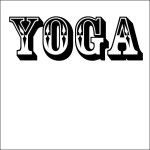
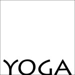
The images depict an enhancement and a challenge to the meaning of the word “yoga” using typesetting, position, and scale:
The enhancement relies on the font Lithos Pro to convey a calm, lithe, and flexible character–the essence of yoga. The text is placed below the bottom of the edge of the canvas, contributing to the organic feel of the image, and the letters resemble stretching human silhouettes, all of which further reinforce the image’s association with yoga.
The challenge relies on the font Rosewood Std to convey a bulky, Western character that is flashy–things yoga most certainly is not. The placement in the top center (and its jumping out of the canvas because of the shadow) gives the impression of outward expression which is contrary to the inward-facing meditation of yoga.
Feedback:
Nobody felt strongly enough about my work to say anything for or against it. All the impressions I heard from Kim were in line with my expectations, so it would seem as though I accomplished the task.
Final Thoughts:
I thought this assignment was fairly straightforward, but seeing other people’s submissions reinforced the notion that everyone defines and associates words differently. If I had to complete this assignment with the words other people had, mine would have turned out completely differently from all of them. Size, spacing, and position seemed to be more important/effective than the direction or path the text followed, but the font face was most significant.


